目录
CSS标签边框动画
核心代码
css
.app-item:hover:before {
  content: "";
  position: absolute;
  top: -3px;
  left: -3px;
  right: -3px;
  bottom: -3px;
  border-radius: 20px;
  border: 2px solid black;
  animation: div5Ani 3s infinite linear

}

.app-item:hover:after {
  content: "";
  position: absolute;
  top: -3px;
  left: -3px;
  right: -3px;
  bottom: -3px;
  border-radius: 20px;
  border: 2px solid black;
  animation: div5Ani 3s infinite -1.5s linear
}

@keyframes div5Ani {
  0%,
  100% {
    clip-path: inset(0 0 98% 0);
  }

  25% {
    clip-path: inset(0 98% 0 0);
  }
  50% {
    clip-path: inset(98% 0 0 0);
  }
  75% {
    clip-path: inset(0 0 0 98%);
  }
}
用法示例
- html代码
html<div v-for="application in responseData" class="app-item"></div>
- css代码
css.app-item {
  width: 47%;
  margin: 30px;
  height: 200px;
  display: flex;
  position: relative;
  border-radius: 20px;
  justify-content: flex-start;
  box-shadow: 0 1px 13px 0 rgba(101, 148, 255, 0.13);
}

.app-item:hover:before {
  content: "";
  position: absolute;
  top: -3px;
  left: -3px;
  right: -3px;
  bottom: -3px;
  border-radius: 20px;
  border: 2px solid black;
  animation: div5Ani 3s infinite linear

}

.app-item:hover:after {
  content: "";
  position: absolute;
  top: -3px;
  left: -3px;
  right: -3px;
  bottom: -3px;
  border-radius: 20px;
  border: 2px solid black;
  animation: div5Ani 3s infinite -1.5s linear
}

@keyframes div5Ani {
  0%,
  100% {
    clip-path: inset(0 0 98% 0);
  }

  25% {
    clip-path: inset(0 98% 0 0);
  }
  50% {
    clip-path: inset(98% 0 0 0);
  }
  75% {
    clip-path: inset(0 0 0 98%);
  }
}
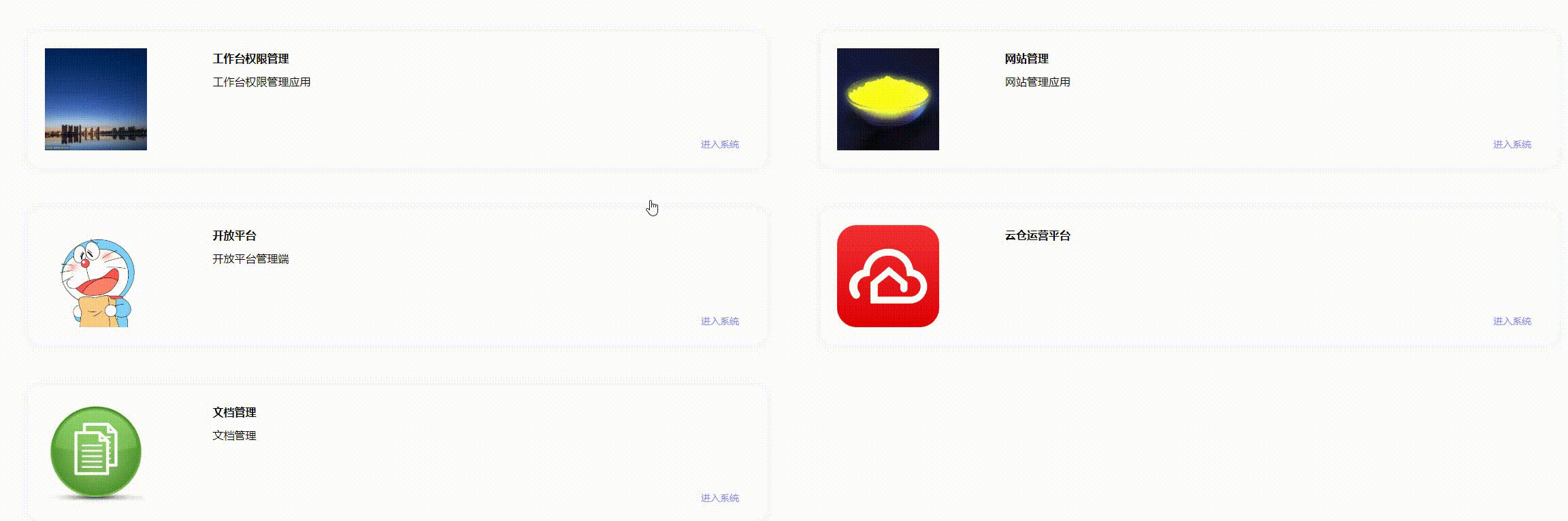
运行结果
本文作者:JACK WEI
本文链接:
版权声明:本博客所有文章除特别声明外,均采用 BY-NC-SA 许可协议。转载请注明出处!
目录